Reading and plotting informations record data
This demo shows how to read data and annotation from record. It also demonstrates some usage of matplotlib library to draw ecg plots.
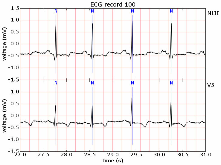
Output image looks like this:
import numpy
import matplotlib.pylab as pylab
from matplotlib.widgets import Button

import pywfdb

record_path = r"d:\mitdb\100"

record  = pywfdb.Record(record_path)

start_time = 27                              # beginning position in seconds
time = 4                                     # data length in seconds
sample_length = int(time * record.frequency) # data length in sample units
end_time = start_time + time                 # end position in seconds

signals_num = record.nsig                    # number of signals in record

# default annotation file has .atr extension
default_ann = record.annotation()

## read all annotations for given range
annotations = default_ann.read(int(start_time*record.frequency), sample_length)

## drawing stuff follows
ylims = (-1.5, 1.5)
t = numpy.arrayrange(start_time, end_time, 1/record.frequency)
vl = numpy.arange(start_time, end_time, 0.2)
hl = numpy.arange(ylims[0], ylims[1], 0.5)

f = pylab.figure()
f.subplots_adjust(hspace=0.00001)

axes = []
ax = pylab.subplot(signals_num, 1, 1)
pylab.title('ECG record %s' % record.name)

annotation_lines = [ann.time/record.frequency for ann in annotations]

def mark_annotations(ax):
    annotation_font = {'family':'monospace', 'color':'b',
                           'weight':'bolder', 'size':12}
    for ann in annotations:
        ax.text(ann.time/record.frequency, ylims[1]-0.2, ann.typestr,
                        annotation_font, horizontalalignment='center')
    ax.vlines(annotation_lines, 0.8*ylims[0], 0.8*ylims[1], linewidth=.5,
                  fmt='b-', alpha=0.8)

for i, name in enumerate(record.signal_names):
    ax = pylab.subplot(signals_num, 1, i+1)
    axes.append(ax)

    pylab.ylabel('voltage (%s)' % record.signal_info(name)["units"])

    # draw pink grid
    ax.vlines(vl, ylims[0], ylims[1], fmt='r-', alpha=0.3)
    ax.hlines(hl, start_time, end_time, fmt='r-', alpha=0.3)

    # read data for specified signal
    # equal to record.read(i, ...
    y = record.read(name, int(start_time*record.frequency), sample_length)

    # draw signal
    ax.plot(t, y, linewidth=1, color='k', alpha=1.0, label=name)
    ax.text(start_time + 1.01*time , 1.2, name, color='k' )

    mark_annotations(ax)

    pylab.ylim(-1.5, 1.5)
    pylab.xlim(start_time, end_time)

pylab.xlabel('time (s)')
xticklabels = [a.get_xticklabels() for a in axes[:-1]]
pylab.setp(xticklabels, visible=False)

pylab.savefig('ecg_plot.png')
pylab.show()